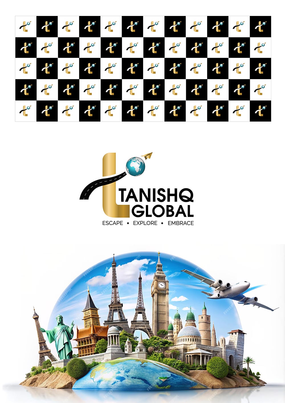
Client: Tanishq Global
Industry: Travel and Tourism
Location: Mumbai, India
Slogan: Escape, Explore, Embrace
The Challenge:
Tanishq Global approached us with the need for a complete brand identity that would resonate with the modern traveler. The goal was to create a logo and visual identity that encapsulated the spirit of adventure, curiosity, and exploration while remaining professional and distinct in the competitive travel market.
Step 1: Understanding the Vision
Our process began with an in-depth discussion with the client. We explored Tanishq Global’s core values, target audience, and vision for the future. With their slogan “Escape, Explore, Embrace,” it was clear they wanted a brand identity that would inspire their customers to embark on new journeys. We also analyzed competitors and industry trends to ensure the brand would stand out.
Step 2: Initial Sketches & Concepts
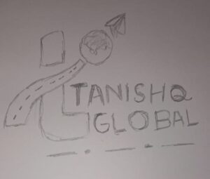
We started with hand-drawn sketches, translating the brand’s essence into potential logo concepts. The initial designs explored different elements, such as:
- Escape: Representing freedom and movement, with abstract shapes that implied open horizons.
- Explore: Symbolizing adventure, with icons like compasses, maps, and pathways.
- Embrace: Evoking connection and care, with smooth, welcoming lines.
Each sketch was designed to reflect these core ideas in simple, powerful visual forms.
Step 3: Refining the Logo
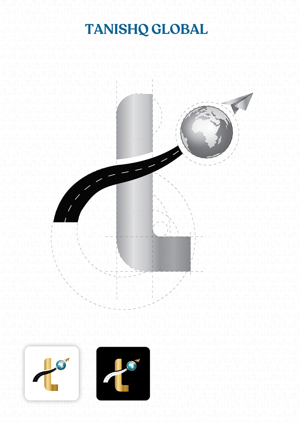
After reviewing the initial sketches with Tanishq Global, we narrowed down the ideas. The selected concept incorporated a globe to emphasize the international nature of their services, combined with a dynamic, upward-moving line symbolizing progress and exploration.
The logo was then digitized, and we experimented with different variations, refining elements to achieve the perfect balance between modern and timeless.
Step 4: Choosing the Brand Colors
We selected a color palette that would evoke feelings of wanderlust and trust:
- Primary Color: A rich, gold to represent stability, professionalism, and the expansive sky.
- Accent Colors: Earthy tones like warm gold and Sky blue, symbolizing warmth, discovery, and adventure.
These colors work in harmony to communicate the promise of global exploration while retaining a luxurious feel.
Step 5: Selecting the Brand Font
Choosing the right font was crucial to solidifying Tanishq Global’s identity. We opted for a modern sans-serif font that is:
- Elegant and Readable: Ensuring clarity in both print and digital formats.
- Versatile: Reflecting the brand’s adaptability, perfect for both formal documents and travel brochures.
The font complements the logo’s curves and angles, making the brand consistent and recognizable across all platforms
Step 6: Brand Identity Guidelines
To ensure the brand remained cohesive, we developed a comprehensive brand identity guide. This included:
- Logo Usage: Rules for correct logo placement, sizing, and spacing.
- Color Palette: Guidelines on how to use the primary and accent colors for various media.
- Typography: Specifications for headings, body text, and subheadings.
- Imagery Style: Suggestions for the types of visuals that would align with the brand, focusing on vibrant, high-quality images that inspire travel.
The Outcome:
The final brand identity for Tanishq Global reflects their adventurous spirit and invites customers to “Escape, Explore, Embrace” the world. The modern, professional logo paired with the rich color palette and elegant typography ensures the brand is visually engaging and instantly recognizable.

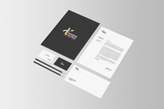
With this new identity, Tanishq Global has a strong foundation to build customer trust and inspire excitement about travel, standing out in a crowded marketplace.
